Packaging Artwork and Printing: A Practical Guide from Dieline to Approved Proof
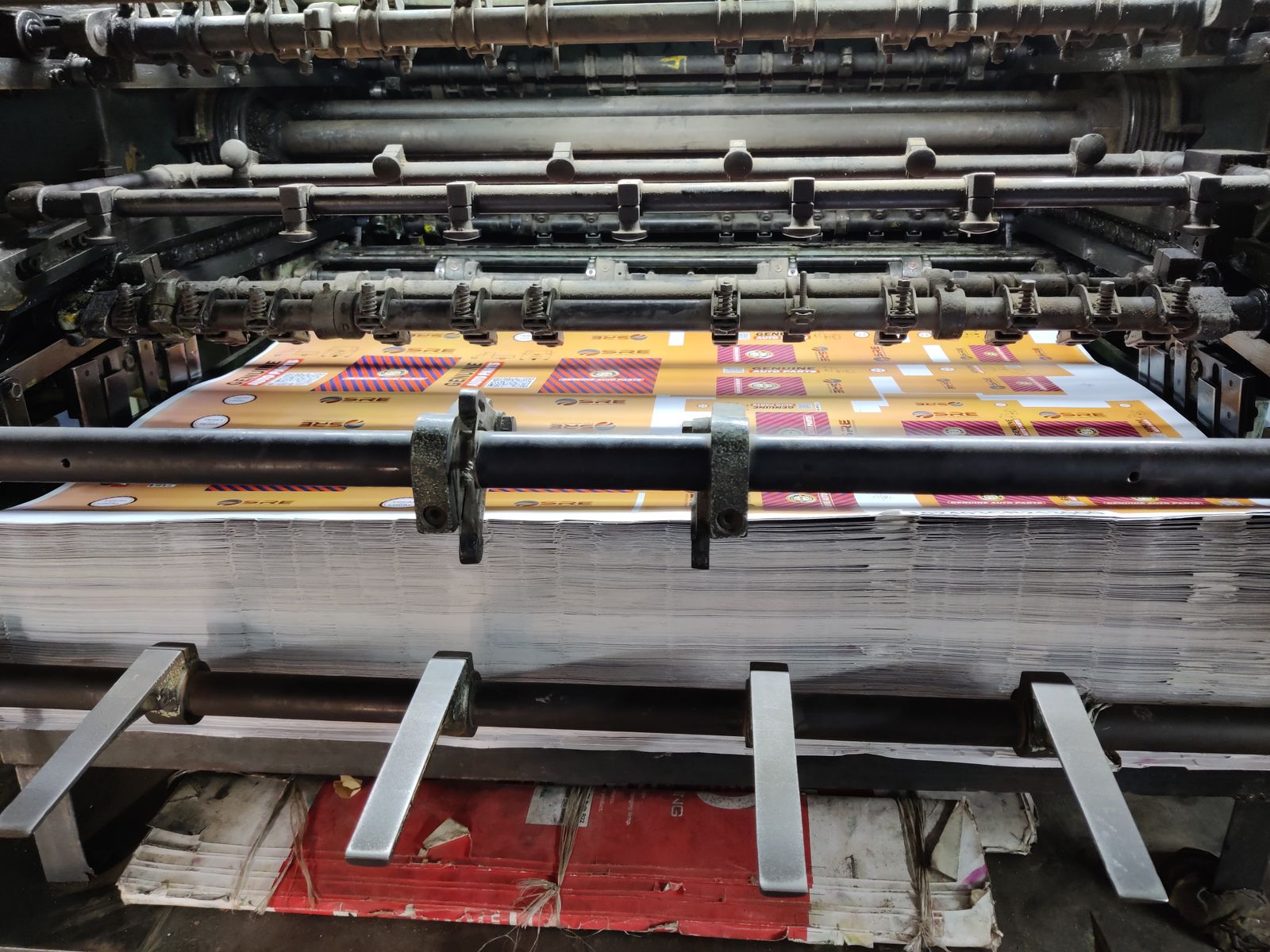
Most brand owners approve a packaging design on a laptop screen and assume the printer will reproduce it. The finished carton then arrives a shade darker, the logo sits closer to the fold than intended, and the barcode will not scan at the checkout. None of these are design failures. They are production failures, and almost all of them are decided in the gap between "the artwork looks good" and "the artwork is ready to print".
Quick answer: what does it take to get packaging artwork printed correctly?
Printing packaging correctly requires four things in sequence: a dieline supplied by the packaging supplier, artwork built to that dieline with correct bleed and colour mode, a defined colour standard (spot or process) agreed before plates are made, and a signed proof that matches what the press will actually produce. The most common cause of a reprint is that one of these steps was skipped to save time. A practical first step is to ask the manufacturer or packaging supplier for the dieline and the printing specification before commissioning any design work, not after.
Key takeaways
- A dieline is a production drawing, not a design template. Artwork built without one usually has to be rebuilt.
- Screen colour and printed colour are different systems. A brand colour must be specified as a physical standard, not an RGB value.
- The same ink formula prints differently on coated and uncoated stock, so the substrate must be fixed before the colour is approved.
- Proofs come in several grades. A PDF emailed for approval is not evidence of what the press will do.
- Regulatory and barcode content should be verified at artwork stage, because errors found after printing are usually unrecoverable.
Who this guide is for
This guide is written for founders and brand managers in the health, beauty, supplement and consumer goods categories who are commissioning printed packaging — folding cartons, labels, sachets, tubes, pouches or shippers — through an OEM (Original Equipment Manufacturer) or a separate print supplier. It assumes the packaging format has already been chosen and focuses on what happens between design and delivery. Readers still deciding on materials and formats may find the earlier guide on choosing product packaging a better starting point.
What is a dieline, and why must it come first?
A dieline is a scaled technical drawing that shows exactly where a printed sheet will be cut, creased, folded and glued. It is issued by the packaging supplier or converter, not by the designer, because it reflects the specific cutting tool that will be used on that job. It typically arrives as a vector file with separate layers for cut lines, crease lines, glue areas and the safe area in which content may be placed.
The practical consequence is that design cannot meaningfully begin until the dieline exists. A carton drawn to arbitrary dimensions will have panels in the wrong places, text crossing a crease, and no allowance for the glue flap. Rebuilding artwork onto a real dieline is not a small correction; in most cases the layout is redrawn from scratch.
Three zones on a dieline matter most in practice. The trim line is where the blade cuts. The bleed is the extra image area extended beyond the trim, normally 3–5 mm, which exists because cutting tolerance means the blade never lands exactly on the line. The safe area is an inset margin, commonly 3–5 mm inside the trim, within which all text and logos should sit so that nothing important is clipped. Artwork that has no bleed will show a white sliver along one edge on part of the run, and that is a defect the printer cannot fix without reprinting.
What files does a printer actually need?
Printers need production-ready vector artwork with embedded or outlined fonts, linked images at print resolution, and colours defined in the agreed colour space. Supplying a design in a screen-oriented format is one of the most frequent causes of delay, because the print supplier must then request a rebuild before quoting or scheduling.
| Element | Usual production requirement | What goes wrong without it |
|---|---|---|
| File format | Print-ready PDF (PDF/X family) or native vector file with all links | Fonts substitute, images reflow, colours shift |
| Colour mode | CMYK for process work; named spot colours where specified | RGB artwork is auto-converted, usually duller than expected |
| Bleed | 3–5 mm beyond every trimmed edge | White edges on part of the run |
| Safe area | Text and logos kept 3–5 mm inside the trim | Content clipped or crossing a crease |
| Image resolution | Typically 300 dpi at final printed size | Visible softness or pixelation on shelf |
| Fonts | Outlined or fully embedded | Silent font substitution at the printer |
| Barcode | Vector, correct magnification, adequate quiet zone and contrast | Scan failures at retail |
| Dieline layer | Present, on its own layer, set to non-printing | Cut lines printed onto the pack |
Barcodes deserve separate attention because the failure is binary. A barcode either scans reliably or it does not, and retailers reject stock that does not. The GS1 General Specifications define permitted symbol sizes, minimum quiet zones and colour combinations — notably that light-on-dark and red-on-white combinations often fail, because many scanners read red as white. Shrinking a barcode to fit a tight panel is a common and avoidable cause of rejected deliveries.
Why does the printed colour rarely match the screen?
Printed colour rarely matches a screen because the two use fundamentally different colour systems. A monitor emits light and mixes red, green and blue; a press lays down ink that absorbs light, mixing cyan, magenta, yellow and black. Many colours that a screen can display — particularly saturated oranges, greens and blues — simply cannot be reproduced with process inks. When artwork is converted, those colours are mapped to the nearest printable equivalent, which is usually less vivid.
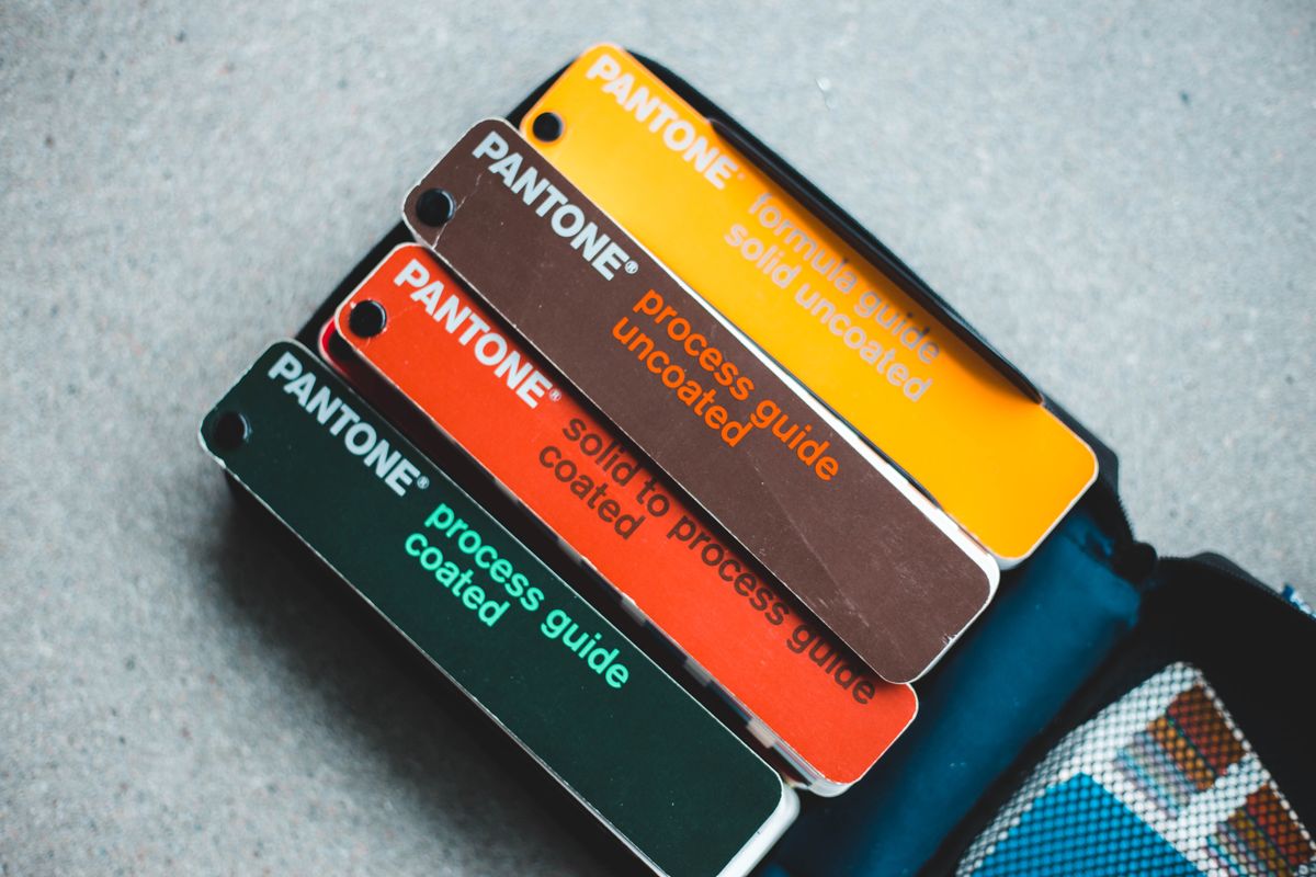
Brands generally handle this in one of two ways. Process (CMYK) printing builds every colour from four inks, which is economical and flexible but gives less precise control over a specific brand colour. Spot colour printing uses a pre-mixed ink matched to a numbered reference such as a Pantone code, which reproduces a brand colour consistently across runs and suppliers but adds a print unit and therefore cost. Many packaging jobs use both: four process colours plus one or two spot colours for the logo.
The substrate then changes the result again. The same ink prints brighter and denser on coated board, and duller and softer on uncoated stock, because uncoated fibres absorb more ink. This is why professional colour guides are published in separate coated and uncoated editions, and why a colour approved against a coated guide can look wrong when the job is finally printed on an uncoated carton. The practical rule is that the material must be fixed before the colour is signed off, not after.
For process work, the relevant international reference point is ISO 12647-2, which specifies process control for offset lithographic printing, including target values and tolerances for colour reproduction. Printers working to that standard can state measurable colour tolerances rather than relying on visual judgement alone.
How do the main packaging printing methods compare?
The printing method is normally chosen by the packaging supplier based on the substrate and order quantity, but brand owners benefit from understanding why a given method was proposed. The choice affects minimum order quantity, unit cost, colour precision and how expensive a late artwork change becomes.
| Method | Typical use in this sector | Strengths | Trade-offs |
|---|---|---|---|
| Offset lithography | Folding cartons, leaflets, outer boxes | High image quality, strong colour control, low unit cost at volume | Plate cost per colour; uneconomic for small runs |
| Flexography | Roll labels, sachets, flexible film, corrugated | Fast on roll-fed and film substrates; efficient at volume | Plate cost; fine detail harder than offset |
| Digital (toner or inkjet) | Short-run labels, launch batches, variants | No plates, low setup, easy versioning and late changes | Higher unit cost at volume; spot-colour matching is limited |
| Rotogravure | Very high-volume flexible packaging | Excellent consistency over long runs | High cylinder cost; only viable at large volumes |
| Screen printing | Direct printing on bottles, jars and tubes | Dense opaque ink, good on curved and dark surfaces | Limited fine detail; usually one colour per pass |
| Foil stamping and embossing | Premium finishing on cartons and labels | Strong perceived-value effect | Extra tooling, extra pass, longer lead time |
One decision follows directly from this table. Because plate-based methods carry a fixed setup cost per colour, a small first production run printed digitally is often cheaper overall than the same run printed offset, even though the per-unit price is higher. Brands launching a limited first batch, or still expecting artwork revisions, frequently find digital the more rational choice for that stage. How such setup costs are absorbed across a run is examined further in the guide to costing a beauty or supplement product.
What are the proof stages, and which one actually matters?
A proof is a sample used to approve a job before the full run is printed, and different types of proof carry very different levels of assurance. Treating a low-grade proof as a final approval is one of the most common and expensive mistakes in packaging production.
- Soft proof — a PDF viewed on screen. Useful only for checking content, layout and spelling. It says nothing reliable about colour.
- Digital proof — a calibrated print, often produced on a proofing printer to a defined colour standard. A reasonable colour indication for process work, though still not on the production substrate.
- Wet or press proof — printed with the actual inks on the actual substrate. The most reliable colour reference, and correspondingly the most expensive and slowest.
- Die-cut mock-up — a physical sample cut, creased and glued into the finished shape. This is what reveals whether text sits awkwardly across a fold, whether the pack stands upright, and whether the panel hierarchy works in the hand.
- First-article approval — the first units off the production run, checked against the signed standard before the run continues.
A practical middle path for many small and mid-size brands is a calibrated digital proof for colour plus one die-cut mock-up for structure, reserving a full press proof for cases where a spot brand colour is critical or the packaging carries significant tooling investment. Whichever proof is used, the version approved should be dated, signed and retained, because it becomes the reference document if a dispute arises over a later batch.
What should be verified before signing off artwork?
Artwork sign-off should be treated as a compliance checkpoint rather than a design review, because printed packaging is among the hardest parts of a product to correct after the fact. A formulation can be adjusted in the next batch and a website can be edited in minutes; twenty thousand printed cartons carrying a wrong ingredient list are usually scrap.
The following items are worth checking against source documents rather than against the previous artwork version:
- Mandatory content — product name, net content, ingredient or supplement facts, manufacturer and importer details, country of origin, and any category-specific statements. Requirements differ by market and product type; the guide to product labelling covers this in more depth.
- Registration and notification numbers — where a market requires a notification or registration number on pack, the number printed must match the current record held with the authority. In Malaysia, cosmetic notification and product registration are administered by the National Pharmaceutical Regulatory Agency (NPRA).
- Claims wording — every claim on pack should be traceable to what is permitted for that product category and to evidence the brand actually holds. Wording that passes as marketing copy is not automatically acceptable on a label, a distinction discussed in the guide to marketing claims.
- Variable fields — batch number, manufacturing date and expiry date are usually applied later by coder or inkjet, so the artwork must leave a clear, correctly sized, unvarnished area for them.
- Barcode data — the number encoded should be checked against the brand's own GS1 allocation, not copied from a similar product.
- Language versions — where a pack carries more than one language, each version needs independent proofreading by someone fluent in that language.
Documented control of packaging materials also forms part of recognised quality systems. ISO 22716, the international guideline on Good Manufacturing Practices for cosmetics, addresses packaging materials among its production and materials requirements, which is one reason established manufacturers insist on a signed artwork record rather than an informal email approval.
What commonly goes wrong, and how is it avoided?
Most packaging print failures trace back to a small number of recurring causes rather than to unusual technical problems. Recognising them early is generally cheaper than any corrective measure taken later.
- Design starts before the dieline exists. Avoided by requesting the dieline and print specification at the same time the packaging format is confirmed.
- Colour approved on screen, or from a coated guide when the job prints uncoated. Avoided by fixing the substrate first and approving colour on that material.
- A last-minute text change after plates are made. Avoided by treating the artwork sign-off date as fixed and consolidating all edits before it.
- Barcode reduced to fit the panel. Avoided by placing the barcode at a permitted magnification during layout, not at the end.
- Approval given by someone who cannot verify the regulatory content. Avoided by routing the final check through whoever holds the registration or notification file.
- Print lead time omitted from the launch plan. Printing, die-cutting and finishing sit on the critical path; the effect on overall schedules is covered in the guide to product launch timelines.
Frequently asked questions
Can a brand supply artwork as a Word or Canva file?
Usually not for production. Most printers require vector artwork built to their dieline with correct bleed, outlined fonts and a defined colour mode. Screen-oriented files typically lack bleed, use RGB colour and place low-resolution images, so the printer has to request a rebuild before proceeding. Design concepts can be developed in any tool, but the file handed over for printing should come from a designer working to the supplied production specification.
How close will the printed colour be to the brand colour?
That depends on whether a spot ink or a process build is used, and on the substrate. A pre-mixed spot ink matched to a numbered reference reproduces a brand colour closely and consistently. A four-colour process build approximates it, and the approximation is weaker for highly saturated colours. If a specific brand colour is central to recognition, it is worth asking the printer to quote it as a spot colour and to state the tolerance being worked to.
Is a press proof necessary for every job?
No. A press proof is the most reliable reference but also the slowest and most costly, so it is generally reserved for jobs where colour accuracy is commercially important or where tooling and volumes are large. For many first runs, a calibrated digital proof combined with a die-cut structural mock-up gives sufficient assurance. The decision is a risk judgement about what a reprint would cost relative to the proof.
Who owns the artwork files and the printing plates?
Ownership is determined by the agreement, and it is not automatic. Designers may retain rights to working files unless the contract assigns them, and printing plates or cylinders typically remain in the printer's custody even when the brand has paid a tooling charge. Brands that may move suppliers later should confirm in writing that they will receive editable native artwork files, and clarify whether any tooling paid for is transferable.
What changes if a brand switches printers?
Colour and finish should be expected to shift slightly, because presses, inks and substrates differ between suppliers. The usual mitigation is to give the new printer a physical sample of the approved pack as the colour standard, plus the numbered spot references and the original dieline, and to require a proof on the new supplier's material before the first run. Treating the changeover as a fresh approval rather than a repeat order avoids most surprises.
How much bleed and safe margin should artwork use?
Common practice is 3–5 mm of bleed beyond every trimmed edge and a 3–5 mm safe margin inside the trim, but the correct figures are those stated on the supplier's own dieline and specification sheet. Tolerances vary by substrate and converting method, and corrugated or flexible packaging often requires more generous allowances than folding cartons. The supplied specification always overrides a general rule of thumb.
Should batch and expiry information be printed with the artwork?
Generally not. Batch numbers, manufacturing dates and expiry dates change with every production run, so they are normally applied at the filling or packing stage by a coder rather than being part of the printed artwork. The artwork's job is to reserve a clearly defined, correctly sized area for that code, kept free of varnish or heavy ink coverage so the print adheres and remains legible.
Sources and further reading
- GS1, GS1 General Specifications — barcode symbol dimensions, magnification, quiet zones and colour requirements.
- GS1, Barcodes standards overview — identification keys and symbol selection.
- ISO, ISO 12647-2:2013, Graphic technology — Process control for the production of half-tone colour separations, proof and production prints — Part 2: Offset lithographic processes.
- ISO, ISO 22716:2007, Cosmetics — Good Manufacturing Practices (GMP) — includes requirements covering packaging materials.
- National Pharmaceutical Regulatory Agency (NPRA) Malaysia, official portal — cosmetic notification and product registration requirements.
Limitations of this guide
The figures given here for bleed, safe margins and image resolution are widely used conventions, not universal rules; the controlling values are always those on the packaging supplier's own specification sheet, which vary by substrate and converting process. Printing method availability, minimum order quantities and cost structures also differ considerably between suppliers and markets, so the comparison table above should be read as a framework for questions rather than as pricing guidance. Regulatory labelling requirements are jurisdiction-specific and change over time, so brand owners should confirm current requirements with the relevant authority for each market before approving artwork. This article is educational analysis and does not constitute regulatory, legal or technical advice for a specific product.
Disclosure: Creaton Poh is the pen name of Poh Tze Kheng, founder of the ORIZI Group, a Malaysian OEM/ODM manufacturer. This article is educational and independent, and is not promotional.
Written by Creaton Poh
Industry Researcher • Author • Vlogger • Manufacturing Strategist
Turning ideas into products. Turning experience into knowledge.
Connect with Poh Tze Kheng on LinkedIn.


Comments
Post a Comment